Just today we have launched our new service PowerShaper Monitor. This is essentially an opening up of our Smart Meter Service for members. With PowerShaper Monitor anyone with a smart meter should be able see and use their smart meter data for a small annual fee.
For Carbon Co-op members, and existing PowerShaper users you will continue to have free access to your smart meter data through our service, but hopefully you will see some improvements to the dashboard, and additional features in the future.
The reason we are doing this is so that more people can take advantage of their smart meter, regardless of whether you are a Carbon Co-op member or not. The fee will help to cover the cost we have to pay to access the data, and to help make the service sustainable with future features being developed.
Whether your are already a smart meter service user already or new to our work with smart meters we would love to hear your thoughts and please give our social media posts a like/share!
Hi Ian, this at the moment there isn’t a huge difference, and it should be a bit of an upgrade to the previous experience on the hub, with a more user friendly interface and a new branding.
The major change at this stage is that it is now available for non carbon co-op members to use for £12/year. Non-members can consent their meter at powershaper.io
In the future we have plans for other improvements and new features which will be available to all users and we hope having a wider audience will help to keep the service sustainable in terms of data access costs as well as the future development plans.
Thanks for the feedback, this is definitely useful to hear, and we will make sure bear this in mind as we continue working on the new interface. This definitely isn’t a case of set-and-forget so we will be taking this all on-board and reviewing everything again soon.
Hi Ian - I’d be interested to know more about this: what was it that you liked about having both graphs on the same page? Was there some additional insight that you could get from seeing both profiles at once? Or was it just good to have all the information available at once? Keen to hear from others on this too.
We are planning a lot more development to the service so we are very interested in what people have found or would find useful from the interface.
Obviously we hope most people will find it an improvement: the new viewer has a more intuitive time period navigation (no more 13-month years!) as well as the ability to define custom time ranges, and next-previous navigation will be released imminently.
We have got around to getting Smart meters from Octopus & they should be fully operational soon. What is the next step for a Carbon CoOp members to sign up?
Regards. Kit
Hey Kit, as a Carbon Co-op member the process should be pretty straightforward. All you should need to do is follow this think for PowerShaper Monitor from the Carbon Co-op Members’ Hub and follow the instructions there to give it a go!
All good, just wondering if there is a way to use this if you don’t have an in home display. When my new Smart Meter was installed, it was too far away from my house (its in a farm shed!) so they didn’t leave me a home display as it wouldn’t have worked…?
Re: Smart meter Data for electricity and gas.
Great improvement having the right and left arrows to scroll left and right between each day as well as being able to select from a calendar.
@mattfranklin Is it possible to to have the x axis kWh) to retain the same scale for each day? This would provide a better visual impact to compare usage for each day. With it changing the same for each day gives the wrong impression.
Hi Peter thanks for the suggestion, and sorry I missed your previous message. One of the limiting factors for this is that on the smart meter itself there is only 13 months of energy data. However, we pull in all of that data (so long as the user has lived at the address for the entire period) and store it so the longer someone has a consented meter the more data we will accumulate so there is hope that we would be able to make longer term comparisons.
As people have been users for longer this is something which might be worth exploring, but my concern at the moment is that very few people will be able to use such a display.
With regards to the scale of the axis, what you are suggesting sounds reasonable, but we would need to check that there are no unexpected display issues - I will look into it and get back to you with a bit more info.
An issue here is that each household has its own range of use. This means that the axis needs to be customised to the range of that household’s use. I expect that most Carbon Coop members are relatively low users for their property type but as more “outsiders” start monitoring, the typical range could well increase.
The start figure of the axis could also be changed. Some users need to start at zero whilst others could start at 500W or more.
My data in the powershaper portal actually goes back 24 months. It started on 17 September 2019. I’m not sure of the significance of that date. Is this the date you had access to the DCC? I’ve probably had a Smart Meter for 5 years. It was changed from SMET1 to SMET2 in Jan 2021 - but all the data has pulled through.
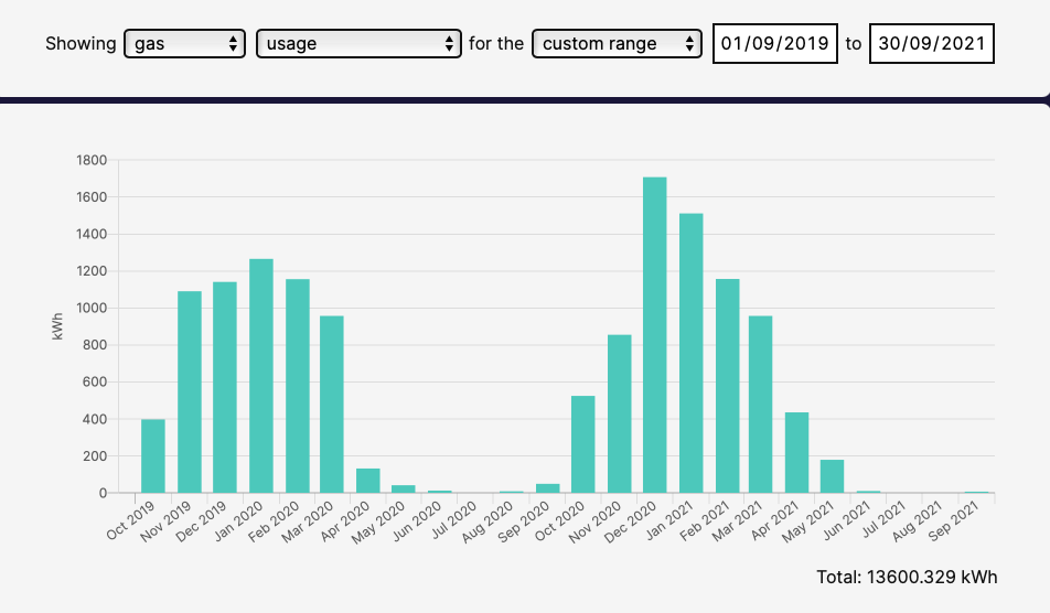
I can get a nice comparison for gas over the last two years. See attached. (Note I have Solar Thermal - that’s why there is no usage during summer months)
I can get a similar comparison for electricity bought - but it is complicated because I was on Octopus Agile and Octopus Outgoing and I have home battery storage - so I was buying extra electricity to sell back to the Grid. Now I have moved to Octopus Go Faster - so I am able to get a better comparison of what I buy - although I now have an EV - so demand will be higher. I further complication is that I also had Solar PV since 2011/12.
@mattfranklin This issue really needs fully addressing before Powershaper Monitor is fully launched. Perhaps a solution is - keep the X axis to the same scale - so that it does not change for the day. But, have a button to enlarge the graph so that it is easier to see graph if a low user views it. However, on the enlarged graph there still needs to be the ability to click the forward/backward buttons in its enlarged state with the scale changing.
One thought that we had was that to help compare energy use on consecutive days (or months or years) we could have the next/previous buttons load the next dataset without shrinking the Y-axis. So if you clicked to view data for the next or previous data using the arrows and the data fits within the current scale we would show it on the same scale. If it contains larger Y-values, it makes sense to zoom out otherwise you won’t actually be able to read the datapoint values there. But then going back would retain the same zoomed-out scale on the lower usage day. Am I making sense? The scale would be reset by make a new request using any of the controls above the graph.
Our intended way for users to be able to compare halfhour usage between days was using the custom date range facility, which shows half-hour usage for consecutive days on the same scale. Are you finding this too laborious or limiting?
@Richard Yes, I think this would be a good solution. (Sorry, I got the labelling of axis wrong, a long since since I was at school. I meant the vertical Y-axis)
Our intended way for users to be able to compare halfhour usage between days was using the custom date range facility, which shows half-hour usage for consecutive days on the same scale. Are you finding this too laborious or limiting?
This certainly does work as well once a person discovers that it is possible. And it is another way of looking at the graphs. But, on first sight of using the tool - it is critical for the scale not to change for each day. The changing scale on the current set-up is very misleading.